Inspiration is often an elusive muse, frequently hiding in the routine of daily life. Yet, for Topps senior designer Phil Imbriano, this fickle muse revealed itself in the humdrum of his everyday subway commute. It wasn’t a grand or monumental moment, but rather a casual glance caught by a red-and-silver badge in a New York City subway car. The sleek lines and modern curves enchanted his designer’s eye. He took a quick photo and by the time the train reached his stop, his mind was already brimming with ideas.
This serendipitous encounter became the seed for the 2025 Topps Series 1 baseball cards, officially launching today. It’s a testament to how ordinary life can inspire extraordinary creativity. “I love drawing inspiration from everyday things,” Imbriano shared with an artist’s enthusiasm that belied the mundane setting of his creative epiphany. “It could be a building, a sign—just something that catches my eye. I take pictures and refer back to them later. You never know when something simple will turn into something big.”
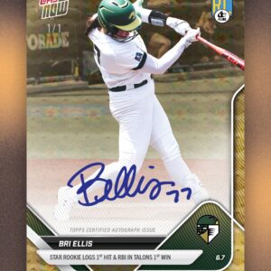
The resulting design showcases two striking lines that arc majestically up the left side and sweep across the card’s crown. For seasoned collectors, these lines might strike a chord of nostalgia—they echo the design of the 1982 Topps set. However, unlike the ‘82 set’s solid-colored lines, Imbriano’s lines are harmoniously matched to each team’s colors, adding a fresh vibrancy to the vintage homage.
Interestingly, the nostalgic thread was unplanned. Imbriano initially sought inspiration from the woodgrain aesthetics of the classic 1962 and 1987 sets. “The ’82 connection was a happy accident,” he recounted with a chuckle. “But I think it works because it blends vintage style with a modern twist.” Indeed, it’s that interplay of past and present that gives the 2025 set its distinctly contemporary edge.
Selecting the design wasn’t a straightforward task. Topps has a competitive process where designers submit their concepts, which then undergo a grueling series of reviews. Imbriano’s submission was the victor among 20 contenders, a decision informed by months of scrutiny. Notably, sometimes elements from non-winning designs find their way into future sets. This year’s set, for instance, incorporates a tiny field graphic in the bottom right corner to denote the player’s position—a nod to past concepts.
Imbriano’s journey from that casual snapshot to the final card design involved crafting around ten different iterations—a testament to the intricate process behind what might seem a simple collector’s item. “There’s so much that goes into this process,” Imbriano revealed. “I don’t think most people realize how much work happens before they ever hold the card in their hands.”
Bringing these digital designs off the screen and into tangible form involves crafting physical prototypes. This tactile phase is critical, says Clay Luraschi, Topps’ senior vice president of product. “When we’re down to the final five designs, we actually print them out and simulate opening a pack,” Luraschi explained. “It’s a long, competitive process, and it’s one of the biggest debates we have in the office all year.”
Luraschi emphasizes the profound legacy each card represents. “Everyone on the team knows how important this is. This is the 74th edition of Topps baseball cards. From the early days when Sy Berger designed them on his kitchen table to today’s high-tech process, we all take that legacy seriously. It’s a big deal—but also a lot of fun.”
But the base design is just the beginning of the 2025 Series 1 adventure. Enthusiasts can expect several beloved subsets, including Future Stars and All-Topps Team. There are also new additions like Training Grounds, highlighting spring training moments, and Call to the Hall, celebrating Hall of Fame inductees. For a bit of Hollywood flair, Signature Tunes pairs players with musicians behind their walk-up tracks. Meanwhile, First Pitch affords a sprinkle of celebrity glamor, showcasing those who ceremonially opened games last season.
Moreover, Dodgers fans can revel in special base-card variations capturing celebratory displays, such as Freddie Freeman’s celebratory “Freddie Dance.” The year’s 35th-anniversary homage honors the exuberant 1990 set’s vibrant color palette, but at its core remains Imbriano’s innovative base design.
“I approach designing cards like I would a movie poster,” Imbriano explained, illustrating his artistic philosophy. “Each card should stand out on its own, almost like a mini poster in a collector’s hands.” This mindset echoes Topps’ enduring design ethos, where each card holds a snapshot of time in its four corners.
Reflecting on his creation, Luraschi praised Imbriano’s work. “I think Phil’s design is incredible,” he added with reverence. “Fifty years from now, people should be able to look at a card and instantly recognize the year it’s from. This one absolutely nails that idea.”
Phil Imbriano’s subway-inspired design doesn’t just capture a moment; it encapsulates the continuous dialogue between history and innovation that defines Topps baseball cards—a testament to the idea that inspiration can indeed strike anywhere, even in the chugging rhythm of a NYC subway car.